


Anderson Craft Ales
Standing out in Ontario's crowded craft beer market
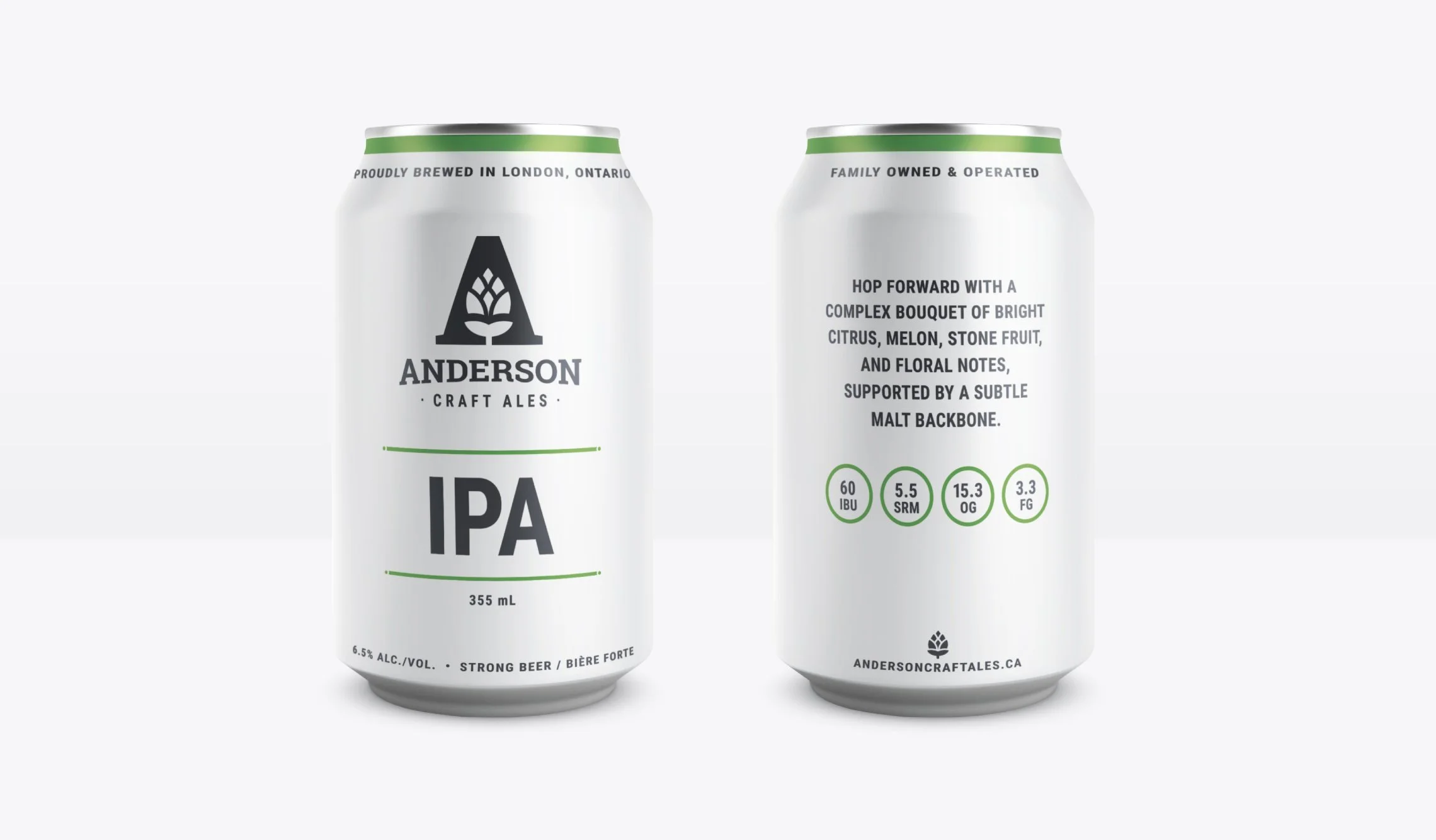
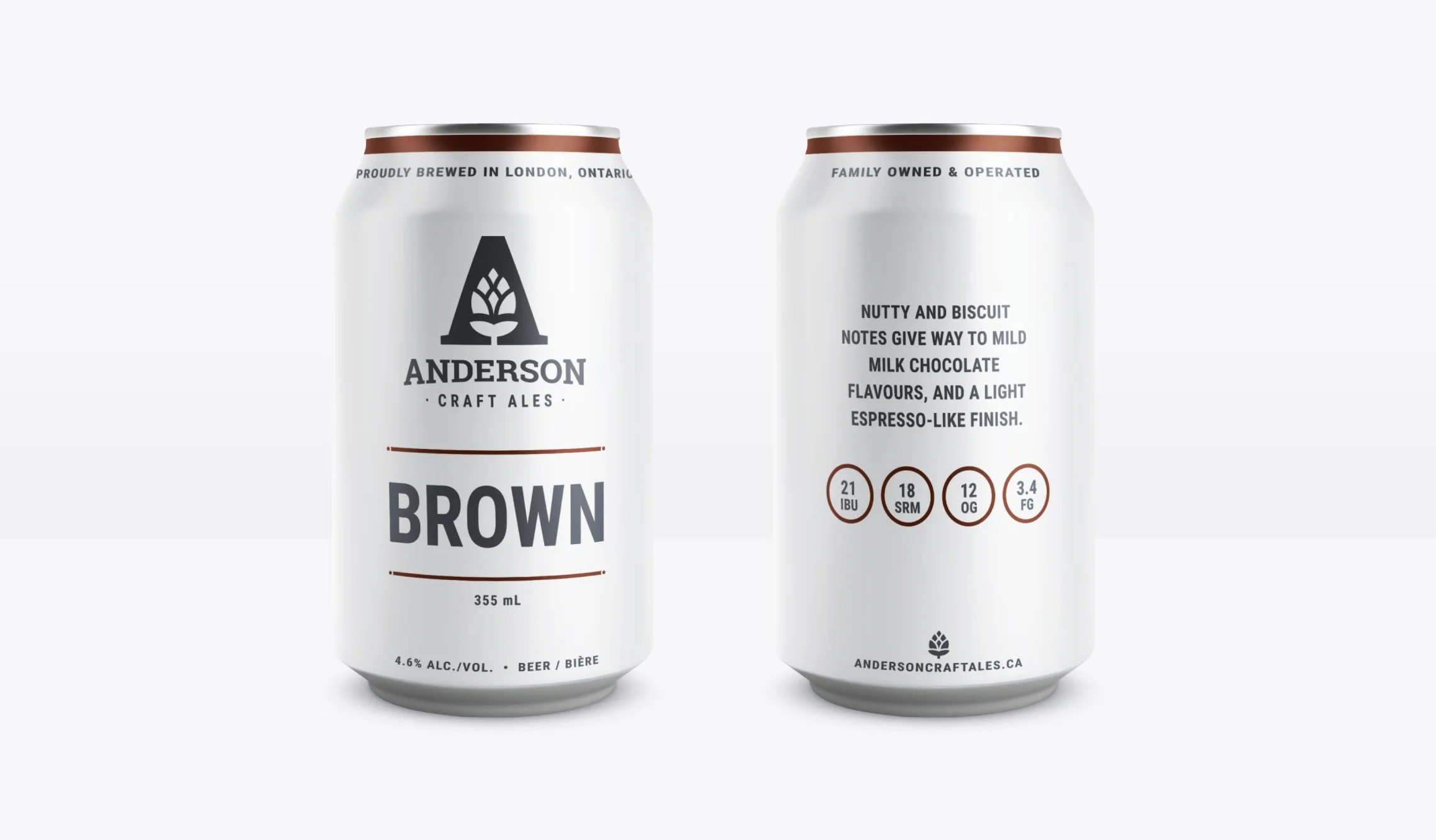
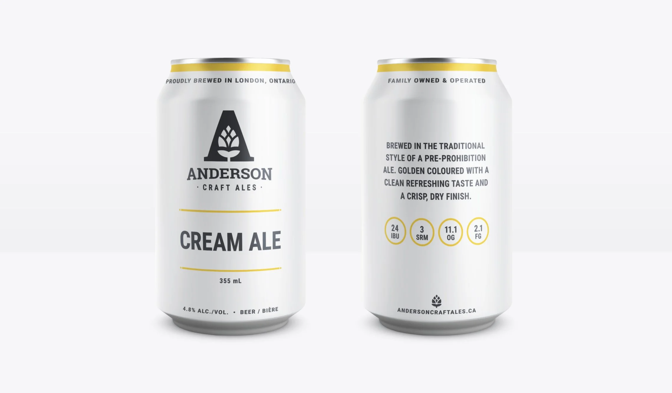
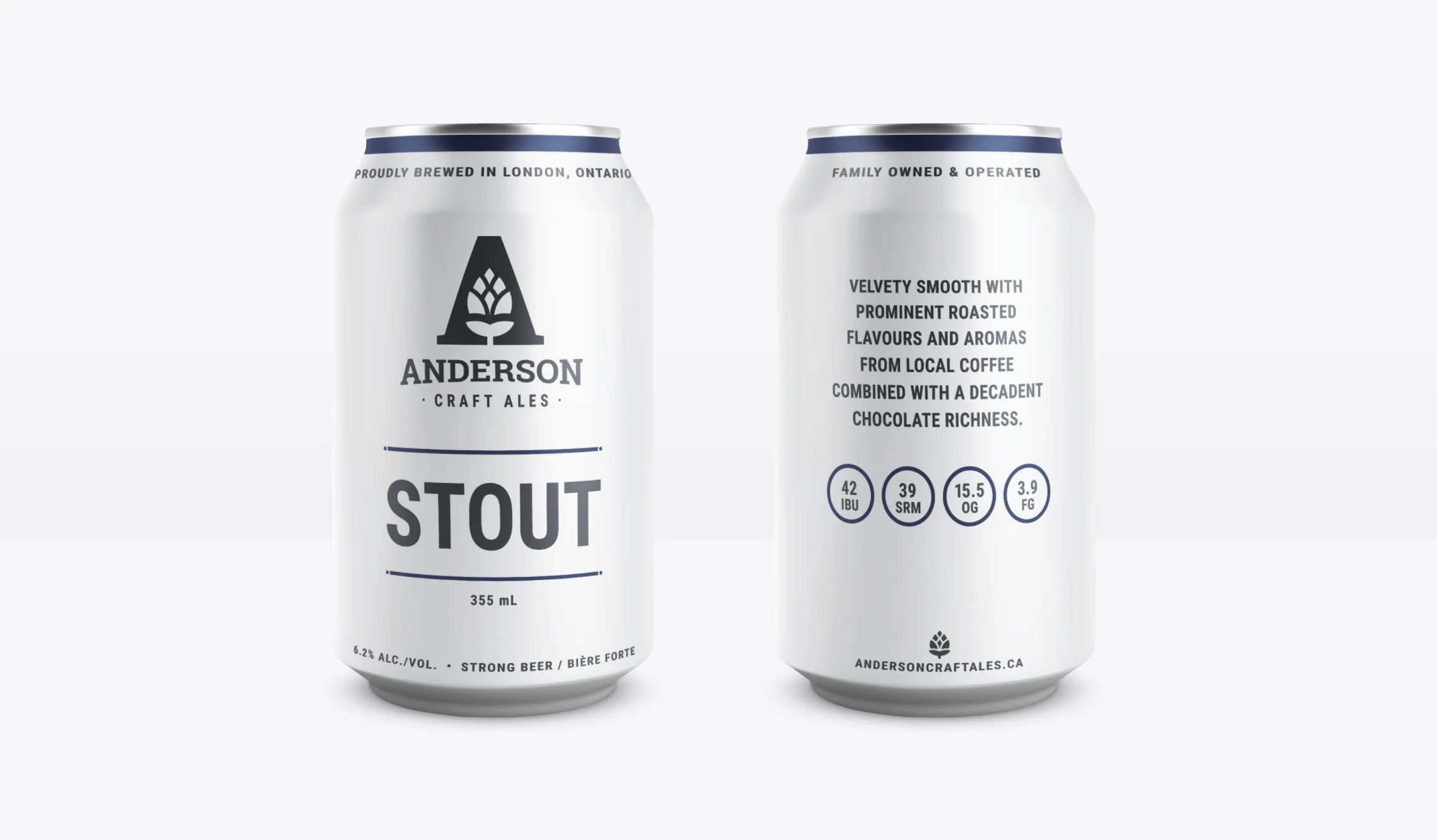
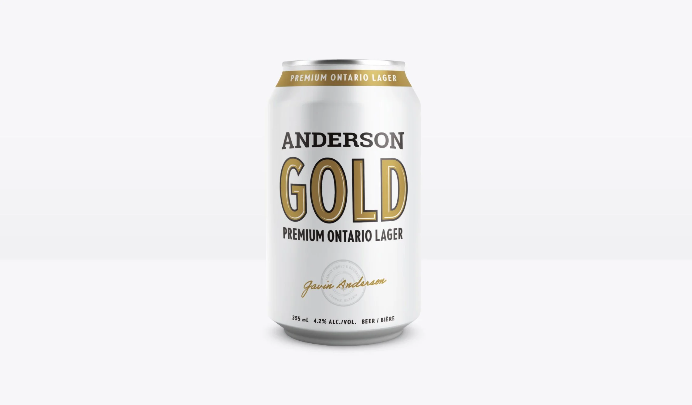
Anderson Craft Ales had the credentials (their award-winning Brewmaster also has a Ph.D. in Microbiology) but needed a brand and packaging that could hold its own in one of Canada's most competitive craft beer markets. The goal was a look built for longevity, not trends. Professional, modern, and approachable enough to bring new drinkers in without alienating seasoned ones.
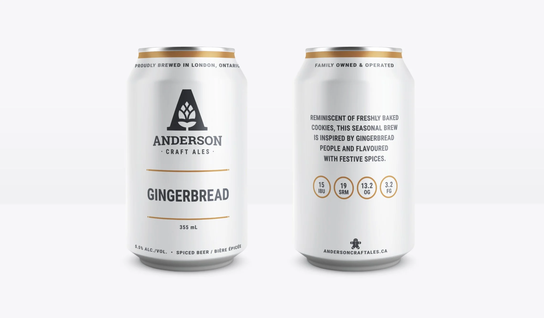
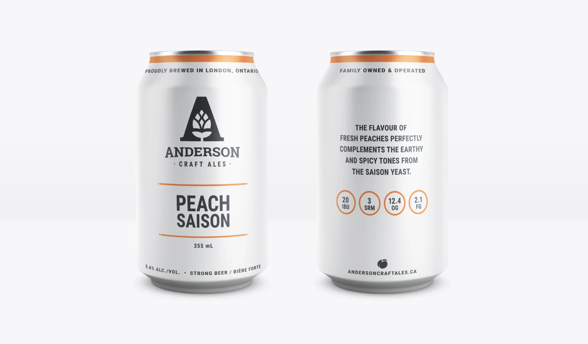
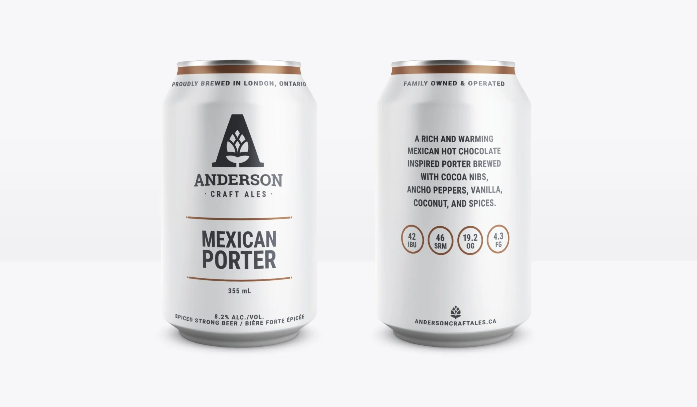
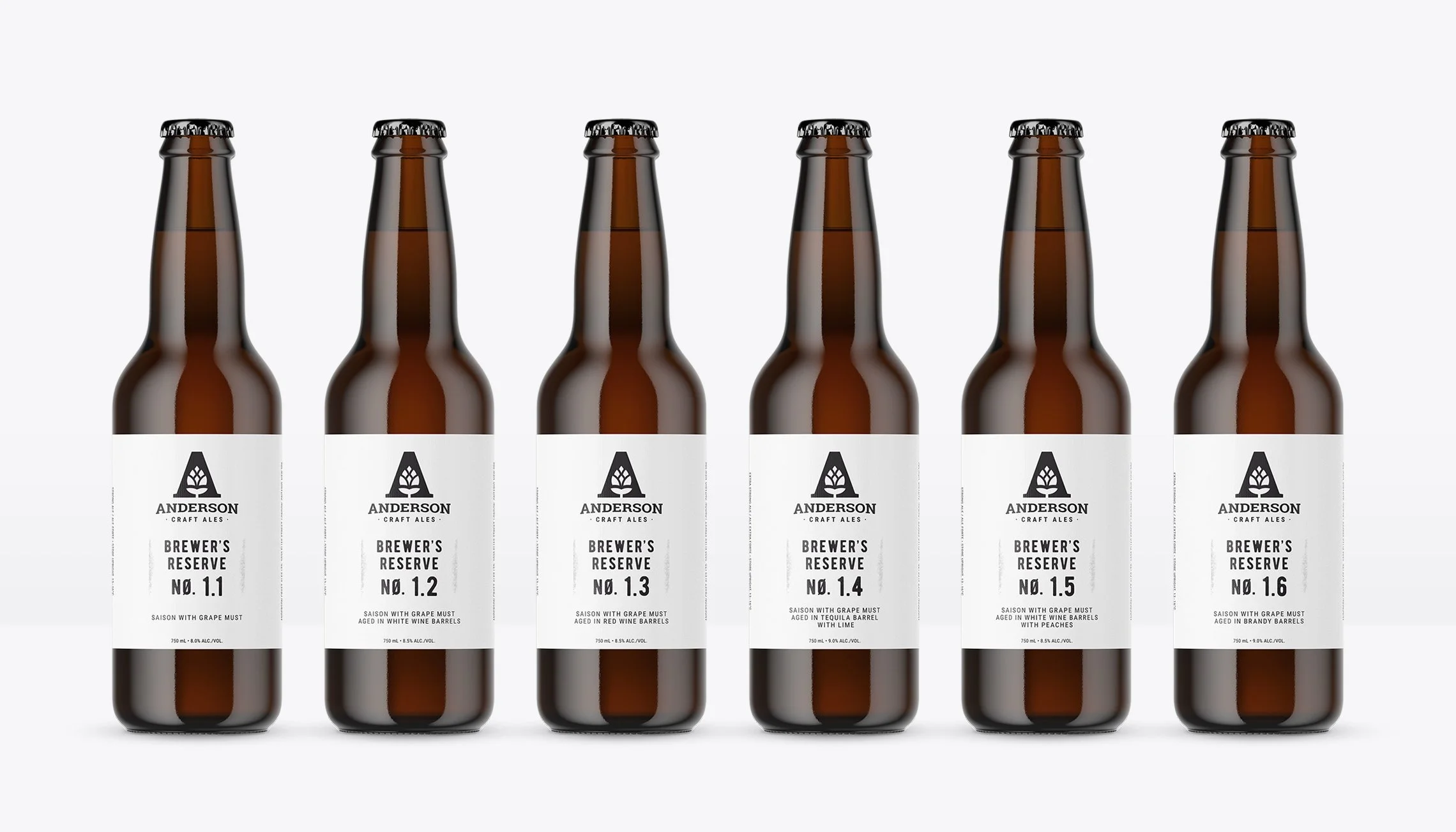
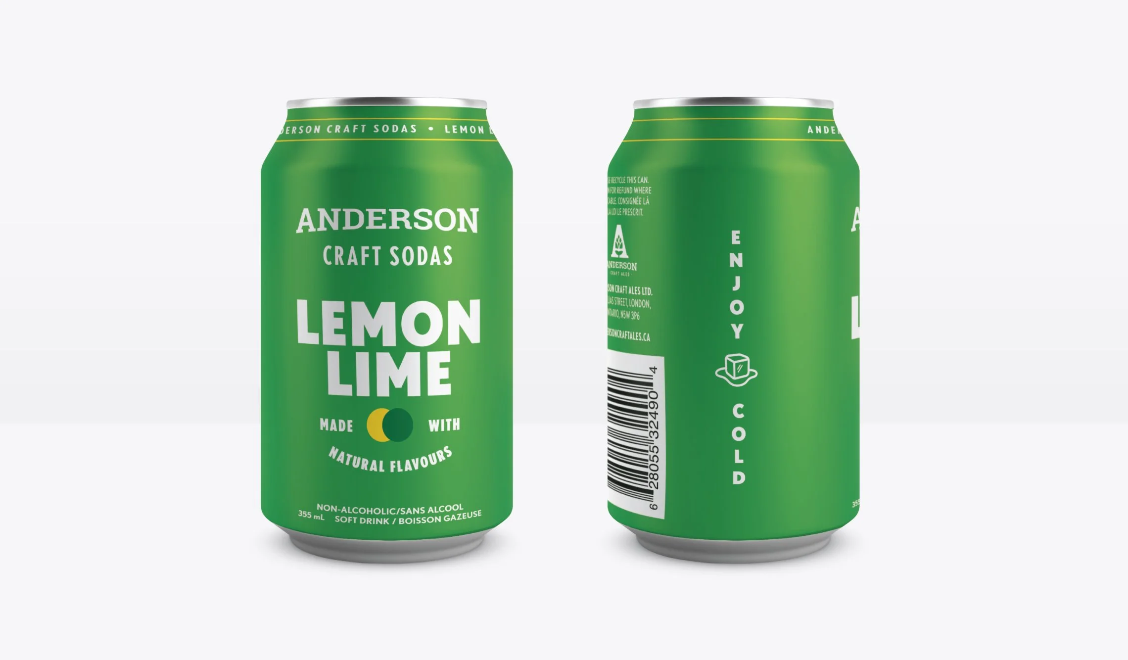
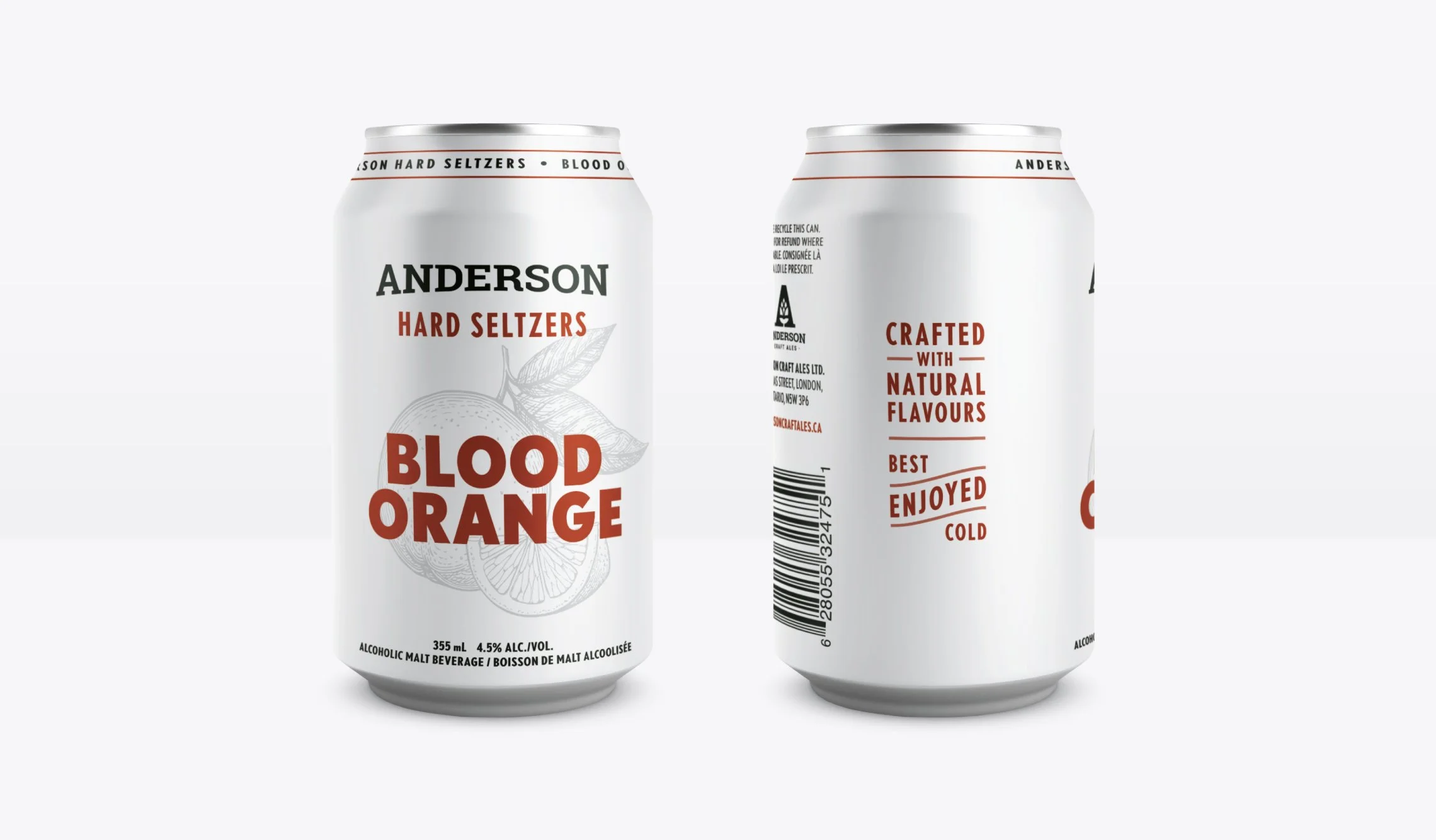
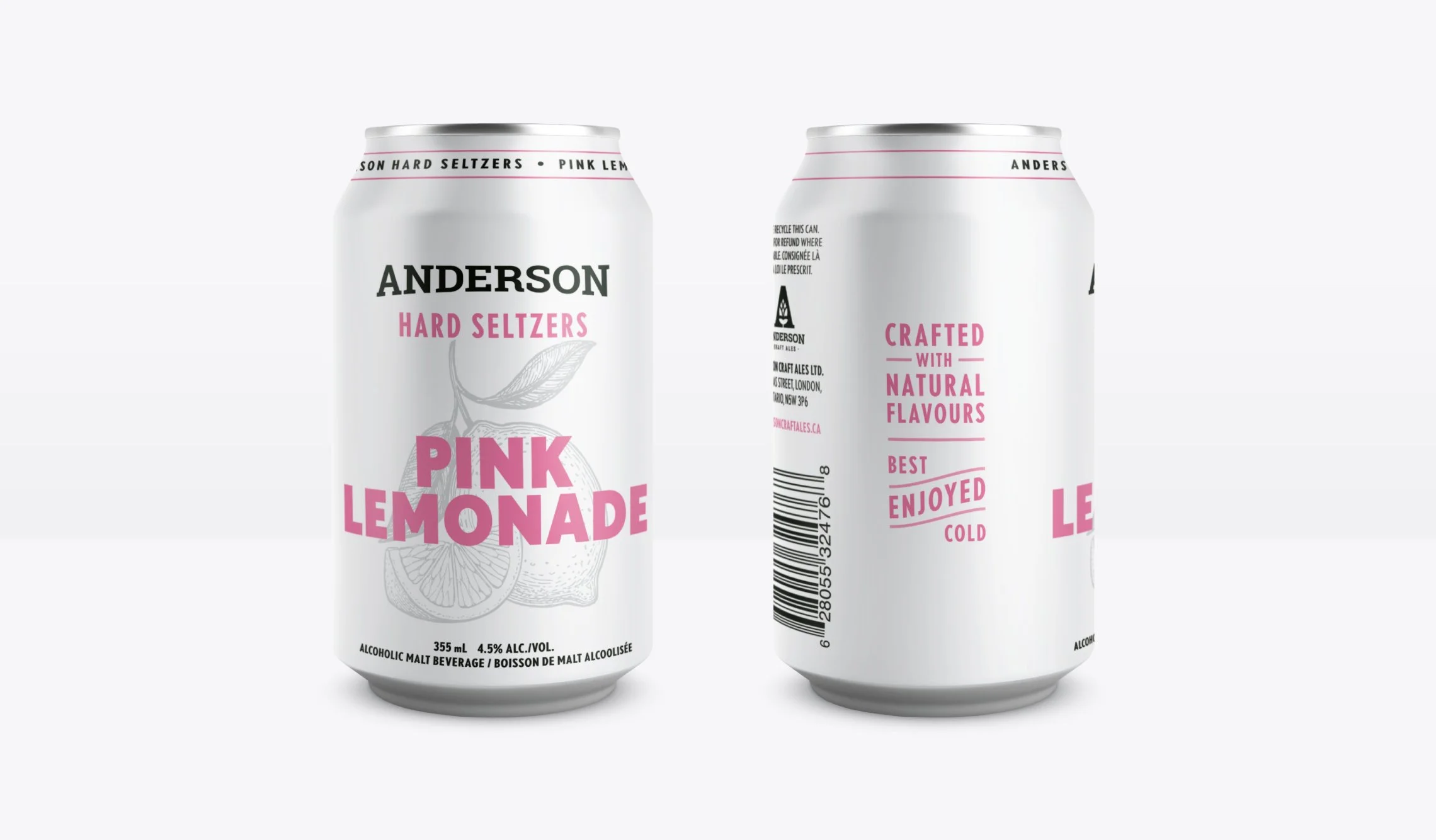
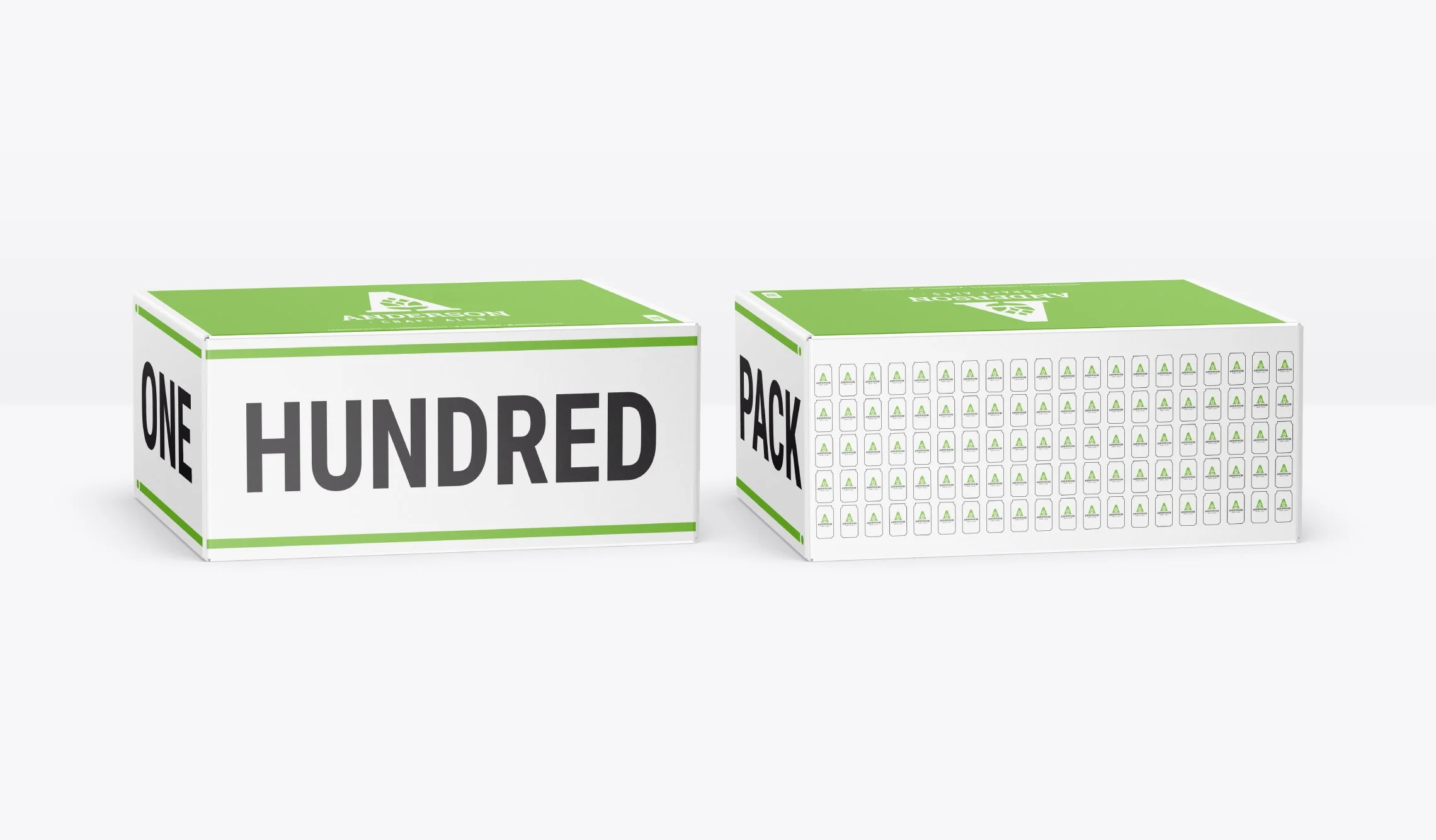
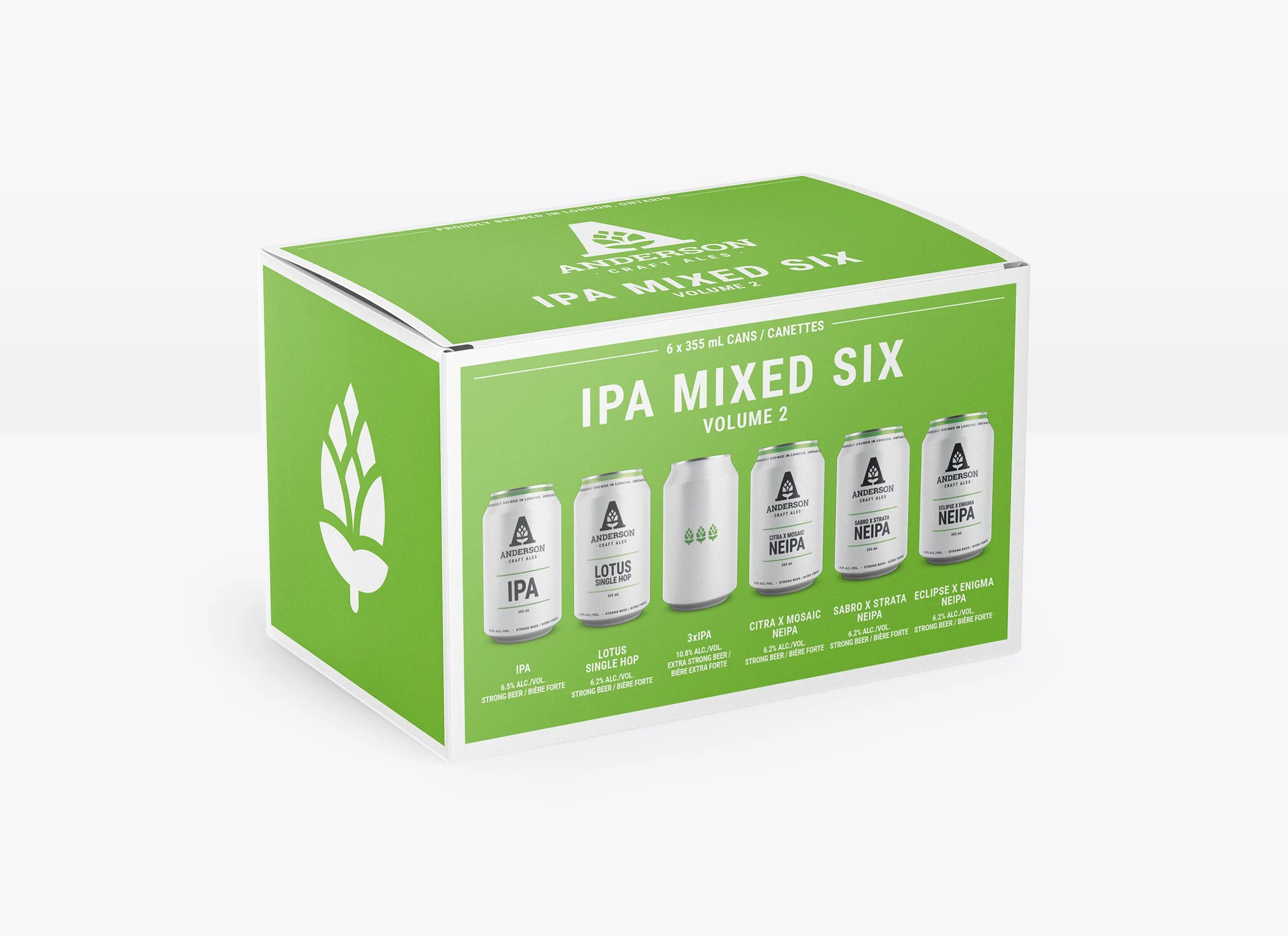
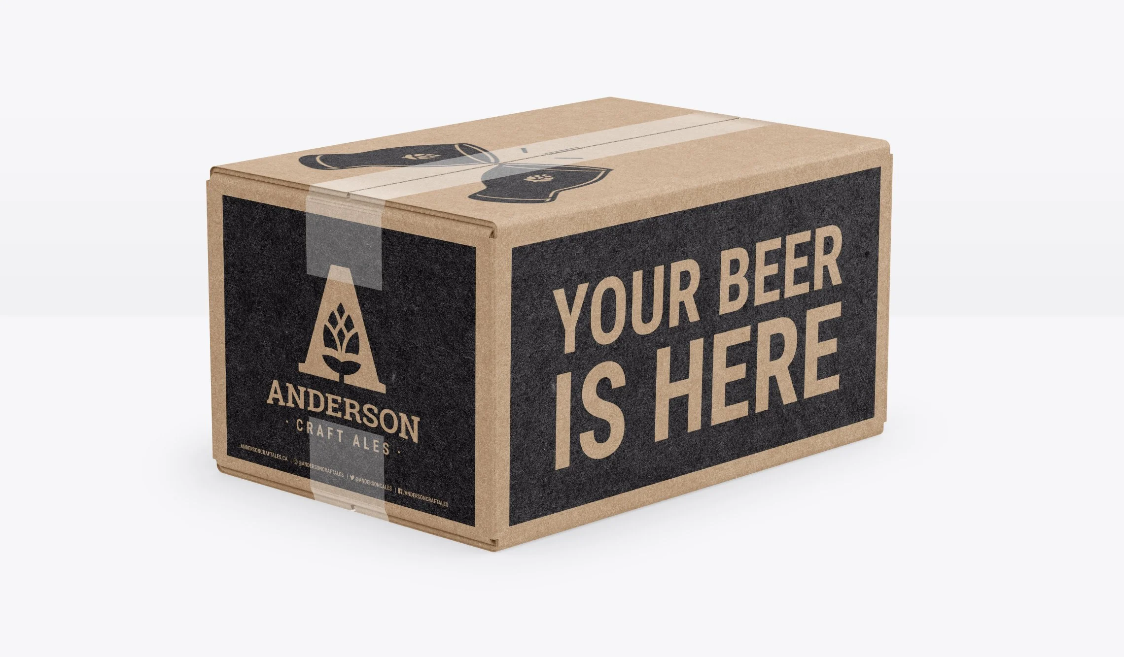
The identity leads with a clever detail, a hop hidden in the negative space of the "A," giving the brand a subtle signature that rewards a second look. On shelf, the packaging does the heavy lifting. Solid white cans let bold hits of colour direct the eye straight to the beer name, creating a billboard effect across the product line. The result is a cohesive, high-impact system that's scaled confidently from core beers to seasonal releases, variety packs, seltzers, sodas, and even a hot sauce.
This project is featured on:


“Brett does an expert job of translating our rough vision into a clean, polished, final design that we couldn’t be happier with. From initial concepts to final revisions, Brett always goes above and beyond to ensure we are happy with the end result.”